Color Inspiration: Neutrals You Can't Go Wrong With!
- Aug 14, 2023
- 5 min read
Updated: Mar 31, 2024
Have you ever entered someone's home and noticed how perfectly balanced and harmonious the entire space feels? This sense of balance is often achieved through the clever use of neutrals within a color palette. By definition, neutral means having features or characteristics that are not easily noticed. However, in the world of interior design, neutral is defined as...
neu·tral [nü-trəl] noun: a soft and understated shade that may appear as if it's lacking color at first glance but actually possesses subtle undertones that can change depending on surrounding elements.
When it comes to incorporating neutrals into your own home, it is always a safe and reliable choice as neutrals provide a solid foundation for any space. With such a variety of neutrals, you may find yourself wondering where to begin.

*Is charcoal considered a neutral? Yes! Read on to find out why.
At Asha Maía Design, our expertise in classic and timeless interiors allowed us to create this guide to neutrals you can't go wrong with! We'll help you navigate from classic whites and beiges to subtle grays and deep blues, bringing an elegant touch to not only the foundation of your home but also foundational pieces such as the walls, sofas, and window treatments. We'll also explore how lighting affects their appearance, paired with our expert tips and top go-to neutrals; you can't go wrong with any of our favorites in this guide!
Our Top Go-To Neutral Colors
Incorporating neutrals into a color scheme and considering where they are applied creates a timeless foundation and allows for endless possibilities. Neutral colors create a setting where the curated details of color, pattern, texture, and lighting can shine. With our top go-to neutral colors, you can confidently select a hue that not only complements classic style but also will help transform your space into a haven of timeless elegance.
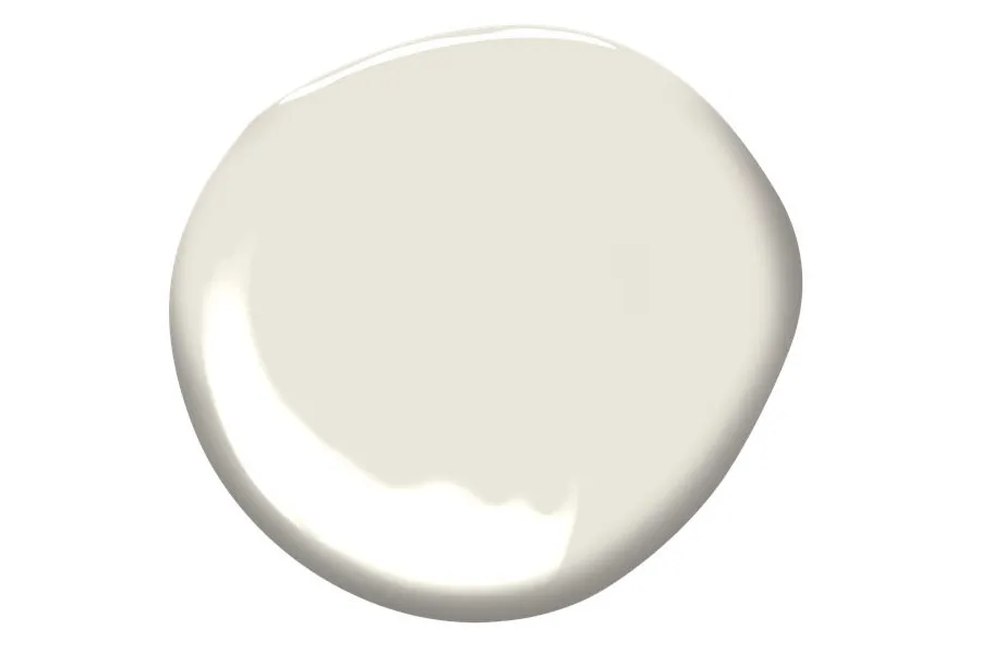
1. White/Creamy Whites: A classic choice, these shades of white bring a sense of warmth and sophistication to any room! Their creamy undertones create a soft and inviting atmosphere, making any of them an excellent choice for living rooms, bedrooms, or even main living spaces.


From left to right: Chantilly Lace OC-65, Simply White OC-117, White Dove OC-17, Swiss Coffee OC-45
2. Greiges (Grey-Beige): Combining gray and beige is the best of both worlds, creating a multi-purpose neutral that can adapt to various styles seamlessly. It offers a subtle, modern twist to traditional neutrals and works well in both modern and contemporary settings.


From left to right: Calm OC-22, China White OC-141, Classic Gray OC-23, Pale Oak OC-20
3. Charcoals/Blacks: If you're looking to add a touch of drama and elegance to your space, charcoal is the perfect choice. Its deep, rich tone adds depth and creates a cozy, intimate atmosphere, making it an excellent option for spaces like bedrooms, dining areas, or even a formal piano room!


From left to right: Gray 2121-10, Cheating Heart 1617, Wrought Iron 2124-10, Black Iron 2120-20
4. Blues: You're probably asking yourself, "Is blue truly a neutral?" Well, here at Asha Maía Design, we definitely think so! We think of blue, much like a pair of jeans; it can go with anything! Its versatility helps define it as a neutral. From powder blues to deep navies, there's a blue shade to suit every taste and style. This variety allows blue to seamlessly blend with other colors, whether warm or cool tones.


From left to right: Brittany Blue 1633, Montpelier AF-555, Hudson Bay CC-810, Hale Navy HC-154
Each of these go-to neutrals can bring its own unique charm and character to your space. Whether you lean towards the timeless elegance of classic whites or the dramatic allure of charcoals, selecting the right neutral can set the tone for your entire home.
You can incorporate these colors not only in the walls of your home but also for pieces like your main upholstered furniture, window treatments, and cabinetry! They can serve as a base to introduce more color and pattern while still maintaining a cohesive look.
When Asha Maía Design is hired for a project, we take pride in our ability to create a color palette incorporating our go-to neutrals that genuinely reflect each of our client's personal styles and unique personalities. This makes for a stunning, timeless look that you'll love for years to come!
Expert Tips for Selecting the Right Neutral
Neutral colors are always incredible to incorporate into the design of a space. They work as great backdrops upon which to build great design. With these top neutral colors you can't go wrong with in mind, here are some expert tips on how we select the perfect neutrals to complete the ideal color scheme for your space.
When developing a color scheme, we always consider three things: the elements utilized in the design, the type of natural light, and the intended mood of the space.

It is important to take into account design elements like furniture, upholstery fabrics, and other textiles, flooring, and any other details that are key to the design of the space. It's essential to consider the undertones of each element and select a color that complements or enhances them. For example, if the home were to have warm wood flooring, a neutral with warm undertones like Simply White or Swiss Coffee would work well.
Another essential element to consider is the natural light in the space. When it comes to paint colors, natural light can significantly affect how a color appears in the space. It's important to take note of the direction the windows face and the amount of light that enters the room throughout the day. A room whose windows face north (or east in the afternoon) will have a cool/blueish cast, and in order to balance the coolness, we'd select a neutral with warmer undertones. A room whose windows face south (or west in the afternoon) will have a warm/yellowish cast, and in order to balance that warmth, we'd select a neutral with a cool or more of a clean undertone.
The color temperature of your neutral can not only help to create balance in the space as it pertains to natural lighting, but it can also play a significant role in setting the desired mood. For instance, soft and warm neutrals like cream and beige tend to create a cozy and welcoming atmosphere, perfect for spaces where relaxation is key, such as bedrooms or living rooms.
On the other hand, cool neutrals like whites or light grays can convey a sense of purity and cleanliness, making them popular choices for bathrooms and kitchens. They also have the power to make small spaces appear larger and brighter, thanks to their ability to reflect light effectively. These cool hues can also stimulate a sense of focus and clarity, making them ideal for home offices or study areas.

At the end of the day, neutrals are a dependable choice that work in a variety of ways depending on the lighting, design, and surrounding colors. With so many shades and hues, being mindful of the details, such as existing colors in the home, will help showcase a timeless color scheme that looks cohesive for years to come. As interior design expert Sandy Hill said, "Neutrals are the anchor to any space — they make everything else look better," and we certainly agree!
Interior Designer Serving Alexandria, Virginia; Arlington, Virginia; Chevy Chase, Maryland; Bethesda, Maryland; Potomac, Maryland; North Arlington, Virginia; Mclean, Virginia; Washington, DC; Falls Church, Virginia; Great Falls, Virginia; Vienna, Virginia, Fairfax, Virginia


Comments